
Game Impact Score
An in-depth look at our new system to quantify player performance

With this bit of a lull between spring practice and the start of our season preview series, I thought this would be an excellent opportunity to do a bit more of a deep dive on Game Impact Score (GIS), a new metric I’ve been trying to develop that I have briefly touched on in each of my last two articles. Simply put, GIS and its associated metrics, GIS+ and pGIS, are the result of my first attempts to create an easy-to-understand measurement of how much of an impact an individual player had during a volleyball match and further translate that into a measurement of the quality of that impact.
Why am I qualified to be the one to attempt this? Well, if I was answering honestly, I’d tell you that my imposter syndrome is absolutely certain that I am not. At all. If I was being more fair to myself, I’d remember that I do have a master’s degree in data analytics, something that should at least indicate that I possess enough knowledge of statistics and data manipulation to understand the mechanics of how this should be handled and what potential pitfalls I should be wary of.
I know what you’re thinking at this point. Mark Twain and his inspiration and that inspiration’s inspiration all agree with you, I’m sure: “There are three kinds of lies: lies, damned lies, and statistics.”
Okay, maybe you’re not actually that harsh about it. Hell, you’re sitting here reading an article on a blog about collegiate women’s volleyball. That likely means you’re no stranger to the sport nor its (and every other modern sport’s) fascination with quantifying player contributions to every contest. How many yards did Tom Brady throw for in his career in the NFL? How many goals did Mario Lemieux score in his final NHL season? How many blocks did Wemby have for the Spurs in the playoffs? And just how many kills did Torrey Stafford have in 2025? All stuff that can be easily answered because some number-obsessed dorks like me decided it was worth keeping record of.
The thing I think volleyball lacks – it may actually exist already in more niche circles of the volleyball community at large – is a deeper culture of more advanced statistics that provide a more thorough understanding of what the hell these numbers actually mean. 2011’s Moneyball provides a good starting point for many people to grasp exactly how that deeper understanding of statistics can result in completely changing the game; the rise of “sabermetrics” in baseball is one of the most visible forms of data and statistical analysis in sports today, and other professional leagues such as the NBA and NHL have gone down similar paths to attempt to understand their sport better, leading to their respective games evolving to value 3-point shooting more and overhauling which players should be on the ice and where during a power play.
Now, I have zero delusions of grandeur about what GIS is or even could be. This being my first pass at something of this scale, I have no doubt that my numbers may be far from an accurate reflection of reality (though I’d love to keep iterating and improving on it). I don’t expect this to change the sport. My only real goal for it at this current juncture is that it can supplement the articles that Brittany and I write. I’ve said before that I don’t want this to be the kind of place that just vomits statistics for the sake of; I hope GIS can be a tool we use to just quantify how good Texas players are compared to others at their position around the country.
And I also hope we can reference it on social media to drive better engagement (read: start arguments with Nebraska fans about how good Harper Murray or Bergen Reilly are).
Background
I mentioned before that I have a master’s degree in data analytics. My undergraduate degree is in mechanical engineering. So what was the appeal of the turn towards data analytics? It may come as little surprise that sports is the beginning and end of the reason I was drawn to it, namely as a result of the frustration I felt while having conversations with people about baseball while they mindlessly parroted advanced analytics that they clearly didn’t understand. I didn’t want to be that person, so down the rabbit hole we went to get a better idea of how and why these advanced stats came to be.
Major League Baseball has WAR which stands for Wins Above Replacement. In the simplest terms, it is meant to take in all of the stats a player records in the MLB, process it, and spit out a number that explains a player’s value to their team in terms of total wins compared to a “replacement-level” player (typically defined as a AAA player who would be called up to replace them if they were out). I’ve appreciated that approach because it creates units of measurement that are easy to understand: a player with a WAR of 7 effectively means their team would have won seven fewer games that season if they weren’t on the team. That measurement is also positionless, so you can more directly compare how valuable a center fielder and catcher were despite having different responsibilities to the team. These were the general ideas that provided a “north star” for the development of GIS from the outset.
And while I do possess the requisite statistical coding knowledge to use R, Python, and SQL for data manipulation and analysis, I greatly lack in my ability to create platforms for sharing the information uncovered (I am incapable of creating anything remotely pretty in Tableau - it’s entirely a skill issue because I know other people are very capable). In the interest of full disclosure, this is an area where I leaned on AI for assistance, specifically in the form of Anthropic’s Claude to help build the dashboard everyone at Point Texas currently has access to in order to view the statistical work and results of those efforts. Hopefully someday soon, there will be a version of that platform that we’ll open up to subscribers here and eventually the wider public, should things grow positively as I continue iterating on it.
Game Impact Score (GIS)

GIS is the launching point for everything else the metrics we’re discussing today are meant to achieve. It is the complete raw measurement of how a player contributed to the match and does not consider performance relative to others on the floor or at their same position. It takes the box score stats from a given match and assigns values to each statistical category. Things like kills, aces, assists, and digs impact GIS positively, but errors of any kind contribute negative impacts. As you can imagine, positions with a tendency to see a lot of “volume” stats score very high here. Outside hitters and setters will rack up a ton of kills and assists and as such end up leading the way in terms of raw GIS while middle blockers who get fewer attempts or have a role defined by much less common events like blocks appear to have those numbers suppressed.
And there is some value in this for us here at Point Texas. Yes, everyone’s capable of looking at the box score and understanding big numbers in the right spots are a good thing. But big numbers in the wrong spots are bad, and this extends a bit beyond that in a concise way. We’re able to quantify how different positions end up contributing different amounts to a game and that not all actions are equal. Digs are critical to the game, but they don’t directly score points, so their value should be represented differently from the value of a kill or block which does score an immediate point. It also allows us to understand how involved a player was in the set or match in valuable ways.
With 47 assists in the match, Ella Swindle scored a GIS of 30.00 in the SEC Championship match against Kentucky. Torrey Stafford turned in a GIS of 32.25 in the same match with 28 kills and 10 digs.
Advanced Game Impact Score (GIS+)

You may see a few immediate glaring holes with the usefulness of raw GIS, so hopefully GIS+ closes the gap in many of those areas.
GIS+ is meant to provide modification to those scores based on a few factors in different areas of the game. For example, a raw count of kills and attack errors only tells a fraction of the story. GIS+ takes the natural next step and corrects a player’s attack score depending on their hitting efficiency. Thankfully, this number is regularly available in a standard NCAA box score, so we’re able to reference it directly, but attacking isn’t the only spot where there needs to be some modifications for efficiency.
A setter with 40 assists in a game is one thing, but it stands to reason that we should score a setter higher if she got to that number with 70 set attempts versus doing it in 100 sets. That sort of efficiency implies that the setter is likely providing a higher rate of good sets that can be converted into assists to the attacker’s kill. Because this doesn’t get included in the box scores that the NCAA website shares, we need to find ways to build out setting efficiency.
To do this, we inspect the play-by-play record of every match. That view of the game allows us to see every set, serve, reception, dig, and beyond and contextualize where so many of the stats that are in the box score show up and the immediate impact of that action. In addition to the hitting and setting efficiencies we’ve discussed, we can determine service, dig, and reception efficiency in order to further detail the quality of the impact on the game.
The last wrinkle in GIS+ is a modifier for opponent quality. Racking up a ton of stats against an 18-12 Weber State in the Big Sky Conference should not count the same as racking up similar stats against a 29-5 Stanford from the Atlantic Coast Conference. For that, we apply a modifier across the entire rest of the score that is dependent on the opponent’s RPI ranking. There is a small benefit for opponents above the Top 50 in the RPI while there can be a precipitously large penalty for opponents that are ranked 250th or worse in the RPI. There is a whole curve defining the exact modification value from #1 to last in the RPI which can tune a player’s GIS+ score depending on what team their stats were accumulated against.
With all those wrinkles added in, we can see the impact in our examples from earlier. After hitting .471, Torrey Stafford scored a 40.03 GIS+ while Ella’s hitting and setting percentages resulted in her scoring a 37.67.
Position Game Impact Score (pGIS)
This is the area of these metrics that I’m most proud of. pGIS is our closest analogue to WAR in Major League Baseball. While it doesn’t provide a total win value, it does allow us to compare players based on how they excelled within the responsibilities of their own position.
pGIS is built by comparing a player’s match GIS+ score to the baseline for their position depending on the number of sets played in a match, then delivers a very clear 0-10 score for the player’s performance. The baseline value for every position is defined as the median score of a starter in the position in every match between 2022 and 2025 (these years selected based on the data quality available from the NCAA’s websites). So if a player has a great game relative to their own position, they’ll score closer to a 10.
To continue with our examples from last season’s SEC tournament final, Torrey scored a 9.96, while Ella’s impact was rated an 8.62. With these scores, I’ve also established tiers to define how good a player’s performance was. A pGIS score above 9.5 is considered Elite. Impact is the tier below beginning at a pGIS of 8.5. Above 7.5 is Solid. Good is defined as above 6.0 with Average being above 4.0, Below above 2.0, and all lower scores simply being Limited.
GIS Dashboard
I mentioned that Claude assisted with building out a full dashboard that can be viewed by anyone involved with making Point Texas. But what all features can we actually see? There are five primary tools at our disposal on the dashboard.
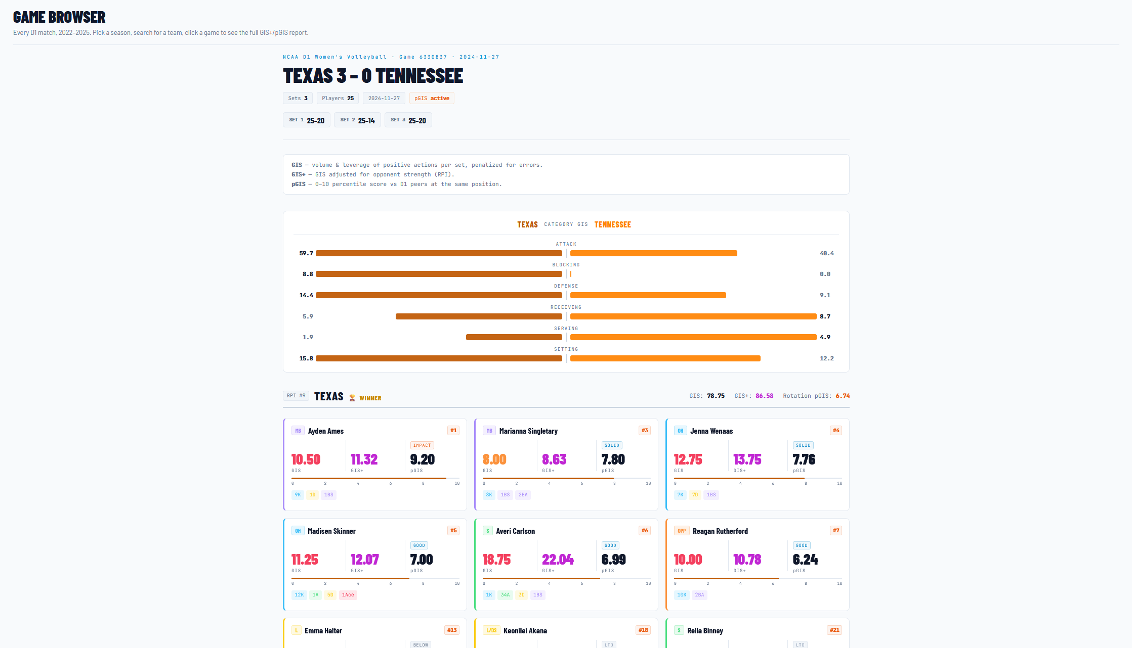
First and foremost is the Game browser. This tool allows us to open up any official game between two Division 1 volleyball teams from 2022 to present and see every single player’s score. From that view, we can further inspect each individual player to see a more detailed breakdown of their stats that led to that score. While GIS isn’t meant to be a team scoring or predictive metric for individual matches, we are able to see a team’s total GIS as well as the average pGIS score for their starting seven (3x pin hitters, 2x middle blockers, 1x setter, 1x libero/defensive specialist). We can also see the GIS breakdown for both teams with a “tug-of-war” chart split by the different areas of the game: attacking, blocking, defense, receiving, serving, and setting.
The next tool is the Player browser. We can search individual players by name and position and get the numbers for their full career, individual seasons, and also individual matches. There is a rolling curve each season showing their pGIS in each match as well as a career GIS breakdown showing their total GIS contribution by the six areas of the game listed above. The tool is generally smart enough to pick up when a player has transferred, so we’re able to clearly identify that Torrey Stafford was at Pitt for two years and Texas last year all in the same view.
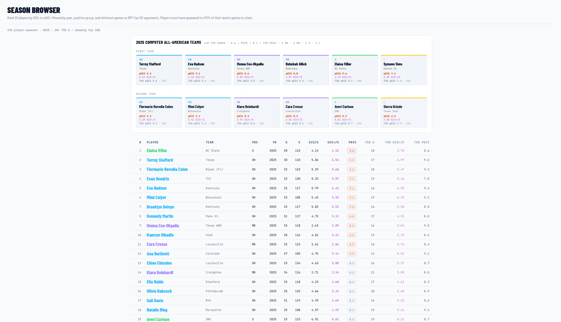
The Season browser is our next tool in the GIS dashboard. It allows us to sort players who are the top scoring at each position in terms of any of our three metrics in each of the years supported by the dashboard currently. It also offers us a sub-view of these metrics where the measurements are only applied to matches against RPI Top 50 teams, effectively making it possible for us to see which players are really “on” when they’re playing the best teams in the country. An extension of that visibility that I’m very proud of is that for every given year, we can create a computer-generated All-American (AA) team. For 2025, Torrey Stafford was joined by Kentucky’s Eva Hudson for the first team AA pin hitters, Ifenna Cos-Okpalla from Texas A&M and Rebekah Allick from Nebraska were the middle blockers, Elaisa Villar from NC State was the setter, and Symone Sims from Kansas State was the first team AA libero, for example.
The fourth tool at our disposal is the Team browser. We can search by year and team and see each team’s best players in order of pGIS with their complete season stat lines as well. For 2025 Texas, we can see Torrey Stafford (9.3), Ayden Ames (6.2), and Emma Halter (6.0) were Texas’ best players by pGIS (keeping in mind that the metric is dependent on production, so Cari Spears only playing 3.5 rotations keeps her off this list).
The final tool we have is really an extension of the Player browser, and that’s the Compare tool. We can select players and years and compare performance of each. If we want to compare Ella Swindle to Bergen Reilly, we can do that directly from a single screen. We can also take it another direction and compare Ella Swindle to herself for all three years of her career and see how her game has evolved the longer she’s been on campus.
In Practice
With this tool up-and-running in its current iteration, it allows us to frame some conversations we like to have here at Point Texas. One discussion Brittany and I have had with the spring portal opening last Friday was about the value of potential transfers into Texas. Lucie Blazkova from Washington State was one such portal entrant; she recorded a season-long pGIS of 8.3 with a 7.9 pGIS in matches against Top 50 opponents. Both would have outpaced Ayden Ames’ numbers last year.
We also plan to use GIS as a premium subscriber benefit. What that means is that we will turn around the GIS scores and discuss them the day after each match for premium subscribers. The regular subscribers will still see GIS referenced and shared, but it’ll be as part of the larger week-in-review articles as part of the pace everyone is used to from last season.
The Future
Next steps for GIS? Find ways to abandon the NCAA box scores entirely. We should be able to build our own box scores entirely from the play-by-play record of every match. That will not only allow us to capture full box scores but also to contextualize every single touch in terms of what the game situation is. A big kill in a close fourth set to win should have a modifier to represent “clutch” factor, rewarding players for big moments when the games are close and their team needs points or a big block.
Additionally, the use of Claude for the dashboard will eventually need to be replaced. As fun as “vibe coding” is, it means we don’t have a true grasp of how to fix issues, and AI tends to be very bloated with its code rather than running things efficiently. Updates could potentially upset the UI uniformity when adding new features. Having a real human doing this (whether I learn how to do it or pay someone to manage it for us) would help immensely.
Finally, we will continue to iterate and tune on the values for each statistical event. Perhaps our weight on digs is too low. Maybe kills are too high. Maybe our calculations are grossly undervaluing receiving as part of the game. By sharing our numbers, it allows anyone smarter than us (i.e. any coaches at any level of volleyball who know things, former players at any level, etc.) to give us some input when a score doesn’t pass the smell test.
We also need to find a way to be efficient about scraping data. The NCAA’s detailed stats site really does not like it when you try to scrape their data, so we either need to find a more reliable source or a workflow that doesn’t set off alarms on the NCAA website when we try to scrape it.
Other Housekeeping
While spring practice is over, there’s still some news to talk about surrounding the Texas volleyball programs.
Beach Volleyball

Congratulations to Texas beach volleyball for an outstanding 2026 campaign! While the Sandhorns fell short of the ultimate goal, they did advance to the national semifinals before getting dropped by the eventual champion UCLA Bruins. Freshmen Anna and Kacka Pavelokova, Texas’ #2 pair at the NCAA tournament, were named to the All-Tournament Team for their efforts. Anna was also on the All-MPSF first team with her sister, Kacka, on the second team.
We’re already looking forward to the program taking the next step under Coach Stein Metzger in 2027!
Schedule Update
Players Era finally announced today the 2026 Las Vegas Volleyball Showcase featuring Nebraska, TCU, and UNLV alongside your Texas Longhorns volleyball program! The two day event will occur Saturday, August 29th and Sunday, August 30th at T-Mobile Arena, just off The Strip in Vegas. Both days will feature doubleheaders, with Texas first facing TCU on Saturday and Nebraska on Sunday as the crown jewel match of the weekend.
Perhaps we’ll have a little Point Texas get-together that weekend, if there’s interest in that. If not, we’ll still all enjoy watching Texas remind Nebraska who their daddy is on Sunday afternoon.
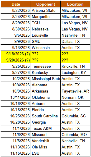
By my count, that leaves us with potentially two more matches to be announced before the regular season schedule is finalized. Given that there are currently zero matches at Gregory Gym in the out-of-conference schedule, I imagine that the 18th/20th (dates subject to change) will feature matches in the suffocating confines of the Greg, possibly against in-state fixtures on the schedule like Baylor or Rice.
Only about 15 weeks until Texas kicks off their 2026 season, so we’ll likely be back to weekly articles in about three weeks as we run through the season preview (please finish the schedule by then, Jerritt!). See you next time! Hook ‘em!